Wednesday, 30 September 2015

Trailer Analysis Presentation

Trailer Analysis Presentation
Captain America Winter Soldier


For our presentation we chose to analyse an action trailer as this is the genre we are choosing for when we make our own trailer so the more trailers of this genre we can analyse the higher quality trailer we hope we will produce in the end. We each had different focuses so that we could analyse the trailer in greater detail and include all the fundamental topics.

Tuesday, 29 September 2015

Costume research

Our film
Costumes


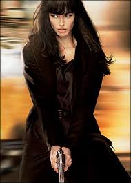
Costume of the protagonist: The protagonist will be wearing some smart clothes as she is an agent so has a formal job and its conventional for agents to dress smartly, unless undercover. At the party scene she will wear a dress to blend in and in America it's likely she'll wear a coat due to weather differences - black is conventional though, or at least darker colours. 


Costume of the antagonist: The antagonist's costume will be very straight forward, the spies costumes are often more causal than the 'bad guys' who are usually very smartly dressed therefore our antagonists will be dressed in suits or similar attire. Our two antagonists will probably be dressed very similar to agent smith (far left) from the matrix and even adopt similar sunglasses like him.

Monday, 28 September 2015

Location Research

Our Film
Settings


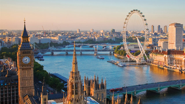
For an action film the settings are unlimited, you could shoot underground, in a fancy house/building, in a field - anywhere as long as it looks visually stunning. We live on the doorstep of one of the most impressive cities in the world - London - and best of all its free and to film there and only takes and hour or so to get to therefore this is a must have for our film, even if its just a few establishing shots of London from the south bank, with it sat right on our doorstep it would be foolish to miss out. Not only that but the trains going up to London look very impressive on film and, just like Big Ben or London eye, are great signposts to give the audience awareness of where they are in the world.  


For a action trailer the conventions are that there are lots of long shots establishing setting as they want the audience to know what part of the world they're in and what to expect from that environment, also fancy buildings, chase scenes in cities and views from high above the skyline are conventional to help make the film look amazing and eye catching. This is therefore a great excuse to jam in as many establishing shots of fancy cities all around the world as in a trailer they don't necessarily need to be elaborately explained - as long as they're in your film trailer it's going to look high budget and visually stunning. As we're going to America early next year it's a golden opportunity to get some amazing shots of the skyline and other signpost buildings in NYC (Empire state building, Statue of liberty) that will make our film look more like a real action trailer.


To make things even better we are also going to Washington in America so can get some great shots of the White House and we plan to film one of our opening shots in front of the Lincoln memorial - really making our trailer look good. Any other opportunities to film scenes in America we will cease but we plan to have back up shots filmed in London before we go in case for any reason we are unable to get the desired shots. 


We also plan to hopefully get some shots of a plane taking off or landing to add in to our trailer to show our character leaving/arriving certain destination and also possibly get a shot of our main character on the plane which we will take when we are actually flying. A great shot which I fear we may not achieve but we will try anyway is a shot of our main character walking through the airport, this poses so many filming problems and is technically quite hard so I don't hold out much hope of achieving it but never the less we will try.


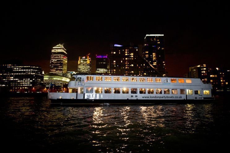
Also linking back to our shots of London is a perfect opportunity to get night shots of London and shots of a party is when we go to our sixth form boat party on the Thames in London. A few establishing shots of London at night and interior shot of the boat party should be enough so that later on in filming we can add context to these shots and fit them in with the rest of our trailer.


Another possibility is filming on the Isle of Wight - a few shots of our main character stood on the cliff top at dusk could look amazing and add to the effect that our film has a massive budget. This is an added extra and if we don't achieve this our film trailer should still look amazing. Boarding/exiting/riding on the ferry could be a back up for if we cant get the plane shots in America.


For our dramatic pinnacle to our trailer we thought using a rooftop would be dramatic - this is quite hard though and to make it more exciting our characters will race up a multi story car park to the top where they will have a stand off to finish our trailer.


So after some time thinking about different settings we have come up with quite a variety that should hopefully make our film look visually stunning and seem as if we have a very large budget. A summary of the locations we expect to use are:
  • Washington
  • NYC - plane
  • Isle of wight? - ferry
  • Boat party
  • London
  • Multi story car park

Sunday, 27 September 2015

Certificate Research

Our film
Certificate Research

U:
·         Suitable for audiences aged four years and over
·         At U we only allow infrequent use of very mild bad language (e.g. ‘damn’ and ‘hell’).
·         Characters may be seen kissing or cuddling and there may be references to sexual behaviour
·         Violence will generally be very mild. A U film may include brief fight scenes or moments where characters are placed in danger.
·         ‘Baddie’ characters may carry or use weapons, but there will be no emphasis on these.
·         E.g. Curious George, The Bee Movie

PG:
·         PG stands for Parental Guidance
·         A PG film should not unsettle a child aged around eight or older
·         A PG film will not contain any theme which is inappropriate for a child. PG works can explore challenging issues such as bullying, bereavement or racism.
·         There may be mild bad language (such as ‘shit’ or ‘son of a bitch’)
·         Sex references are unlikely unless they are undetailed and infrequent.
·         Violence will usually be mild.
·         E.g. Saving Mr. Banks, Shrek

12A
·         12 contain material that is not generally suitable for children aged under 12
·         The 12A requires an adult to accompany any child under 12 seeing a 12A film at the cinema
·         The BBFC's Guidelines state that strong language (e.g. 'fuck') may be passed at 12 or 12A (Non Aggressive)
·         Moderate language (e.g. uses of terms such as ‘bitch’ and ‘twat’ at 12 or 12A).
·         Sex may be briefly and discreetly portrayed at 12A or 12. Verbal sex references should not go beyond what is suitable for young teenagers also there may be nudity
·         At 12A, moderate violence is allowed but it should not dwell on detail. There should be no emphasis on injuries or blood,
·         Some horror films are passed at this category. Moderate physical and psychological threat is permitted at 12A or 12A.
·         E.g. Hancock, The Switch

15:
·         Strong violence
·         Frequent strong language (e.g. 'fuck). Occasionally there may be uses of the strongest terms (e.g. 'c***'),
·         Portrayals of sexual activity
·         Strong verbal references to sex
·         Sexual nudity
·         Brief scenes of sexual violence or verbal references to sexual violence
·         Discriminatory language or behaviour
·         Drug taking
·         E.g. 21 Jump Street, Bridesmaids
18:
·         Very strong violence
·         Frequent strong language (e.g. 'fuck’) and / or very strong language (e.g. ‘c***’), There is    no limit
·         Strong portrayals of sexual activity
·         Scenes of sexual violence
·         Strong horror
·         Strong blood and gore
·         Real sex (in some circumstances)
·         Discriminatory language and behaviour
·         E.g. Taken, Kill Bill


Considering all the features of each certificate we have decided our film is a 15 as it will contain some use of strong language and violence, although there will be no sexual  activity we still feel  is should be classed as a 15 as that’s the  most appropriate seen as the level of violence and strong language wouldn't be appropriate for a 12 year old yet we want to avoid an 18 certificate as that would cut out to large a portion of our audience would be unnecessary as the blood/gore won't be that strong and nor will the vioence

Saturday, 26 September 2015

Institution research


Our Film
Institution Research


Twentieth Century Fox Film is one of the six major American film studios. The company was formed in 1935. Twentieth Century Fox distributes various commercially successful films such as Avatar, Stars Wars. The majority of popular films that they have created are comedy and family for example Alvin the Chipmunks, Diary of the Wimpy Kid. They prefer to make these film genre as it’s most profitable however when it comes to action movies they do have many successful films under their belt. As they are a large corporation they have made a worldwide gross of over $250,000 for many of their X-men films, this shows 20th century fox could be a good institution to use. 


Lionsgate is a Canadian-American film production and distribution studio and a division of Lions Gate Entertainment. It’s the largest and most successful mini-major film studio in North America. They produce and distribute motion pictures, TV programming, home entertainment and family entertainment. Majority of their films are similar genre and the genres they produce/distribute are Drama, Action and Thriller. Liongate has some of the best horror films in the decade; these include Saw, The Last Exorcism, and My Bloody Valentine. Its first major box office was American Psycho; it earned $4,961,015 (USA) and £749,526 (UK) in the opening weekend. After researching action films from Lionsgate I have found that they have produced many successful action films like Crank and more impressively the hunger games film series so are definitely a potential institution we could go for.


Universal is another of the six major American film studios, the company was formed in 1912. Universal has distributed various commercially successful films such as Jurassic world, Despicable me and the Fast and furious film series which has grossed over $3 billion worldwide. The majority of popular films that they have created are action for example back to the future, gladiator and the fast and furious film series which is perfect for us as we are looking to create an action film trailer - something which they seem to specialise in. They prefer to make these film genre as it’s most profitable and when it comes to action movies they do have many successful films under their belt. As they are a large corporation they have made a worldwide gross of over $6.5 million for their most successful film - Jurassic world , this shows Universal could be a good institution to use. 


Warner Bros. Entertainment Inc. (commonly called Warner Bros.Warners, or simply WB) is an American entertainment company that produces film, television and music entertainment. As one of the major film studios, it is a subsidiary of Time Warner. It was formed in 1923 as is known for producing the harry potter film series as well as other sensational blockbusters such as American sniper, The Blind side, Inception, Gravity amongst other things. Therefore it is a serious possible candidate for use to use for our institution as it's most successful film is the two films from the dark knight trilogy that grossed over $5 each.

Friday, 25 September 2015

Soundtrack Research

Our film
Soundtrack Research


The expression soundtrack generally refers to the music in a movie or television program, and to an album sold containing that specific music. Sometimes the music has been recorded just for the film, often but not always depending on the genre of the movie the soundtrack album will contain portions of the score, music made for dramatic effect s the movie's plot occurs. There are three different types:

- Musical film soundtrack (not relevant to our genre)
- Film scores (background music)
- Albums of pop songs heard in whole/part of non-musicals
  • Action: usually include high energy, big budget physical stunts and chases, possibly with rescues, battles, fights, escapes, destructive crises (floods, explosions, natural disasters, fires etc.), non-stop motion, therefore a soundtrack with spectacular rhythm and pacing as well as being fast paced and having a high tempo would be suitable to carry the audience on this physical journey and to get them feeling energised like the characters. 

Thursday, 24 September 2015

Audience research

Audience Research
Action


As most would expect action movies attract generally a male audience as it's stereotypical for men to be drawn to violence and guns and gore. Women don't tend to see as many action films and prefer a film with romance or drama that isn't so far fetched and they could imagine their lives being like. Men also don't worry too much about an intricate plot, as long as there's a hero and got girls with lots of explosions and guns then they're usually happy.

Most male teenagers love a good adrenaline burst so watching a good movie filled with action which is sure to get your heart pumping would appeal to those who have not yet reached adulthood. This interest in the action genre could continue into adulthood extending the age range to 40+ zone however sometimes adults prefer to slow down from then which means the films loses those aged 50+. Action films appeal to the younger generation making them the majority and the primary audience.

People who go see action films are usually interested in gunfights, catchy quips, escapism, adrenaline burst etc. People who watch this film wouldn't go just because the could go, there has to be something that appeals to their interests. Be it there love for comedy, action, huge idea of escapism or the concept of all the action making your body brim with adrenaline through the action scenes.

Overall the type of person who like action is a male teenager to young adult who has an interest in gore and violence and they like guns or chase scenes etc (both conventions of an action film).

To incorporate this into our action trailer we will have scenes:

  • lots of action scenes (chases/gun fights ect) for adrenaline rushes
  • some punch ups, blood, bit of gore
  • not too intricate plot - as long as they're's guns and violence men will go see it
  • possible love interest or female lead to draw in female audiences

Wednesday, 23 September 2015

Genre Research

Genre Research
Action
  • Hero and a villain
  • Good vs Evil
  • Over dramatic settings and scenes with countless explosions and deaths all for the audience’s enjoyment. 
  • Looks as if evil will reign supreme until an old character returns or some unforeseen event occurs causing good to survive
  • One or more heroes is thrown into a series of challenges that require physical acts
  • They quite often have extended fights and chase scenes
  • They may have a resourceful character struggling against incredible odds such as, life threatening situations, an evil villain, and/or being chased in several ways
  • Victory is normally achieved at the end through huge physical efforts and violence
To incorporate this into our action trailer we will have scenes:
  • Establishing good vs bad
  • Physical punch ups and action scenes
  • Chases scenes
  • The villains will look set to reign supreme
  • Explosions/gun fights
  • Villains will be eastern european

Tuesday, 22 September 2015

Initial ideas

Initial Ideas

I am interested in producing a marketing campaign for an action film as I feel making a trailer for this genre is achievable and can be made to a high standard. I'm expecting this genre to be more challenging than others (for example horror) but I want to create something better than just the least I can get away with.

It can have high levels of excitement and still have enigmas to draw in audiences, it can test our editing skills as the cuts require to be crisp and precises and allow us to film a wide variety of shots. 

The target audience is mainly male and the age range varies but audiences look for the same thing - explosions, fighting, good vs bad, love interest, blood and violence.

Conventions of an action trailer are: fast paced montages, linked with romance/sci-fi/adventure, predictable chain of events (cause and effect), dramatic non-diegetic sound, romantic sub-plot, humourous dialogue, relationships with technology, single words written massively across the screen, brief pause just before climax - often one of the characters say something witty.

Checklist:
- guns
- girls
- car chases
- low key lighting
- good vs bad (protagonist vs antagonist)
- pulses of music
- dramatic pause before climax
- romantic sub-plot/humorous dialogue

Monday, 14 September 2015

Wednesday, 9 September 2015

Film Magazine cover analysis (x5)

Film magazine cover analysis
Premiere - Spider-man 3

The magazine title 'Premiere' is written in blue with a grey headline above it - this is reflected in the cover picture where the man's blue eyes are under his dark-grey coloured eyebrows. 

Following the colour-scheme, the additional headlines down the left side alternate between black and blue text )to separate the actors names and make each one stand out and look separate from the one before. It also stops it from blending into one long list that wouldn't interest nor stand out to the reader. However the 'Oscar bonus' title at the top (telling the reader what the list of actors below is referring to) is larger to separate it from the list it's advertising.

The headline for the cover picture is 'The secrets of spider-man 3', the part of the headline in the largest text is the movie title 'spider-man 3' as this is what readers are meant to be drawn to.

The alignment of the headlines is centred around the man in the cover picture, some of the text overlaps parts of the image of him, for instance the text '& many more' and the title of the magazine which runs along his hairline but he is clearly the main focus of the cover - as he is the main character.

The colour scheme is black, grey, white and blue - they can all be found in the cover picture (hair and suit are dark, grey detail on the suit, the background is off-white and his eyes are blue) this shows consistency and makes the cover look professional.

The headline 'when stars collide' is written in bold, black text, the name dropping section below is in blue and then below that is further black text - copying the alternating pattern on the opposite side of the page and maintaining the professional look.

The bottom of the magazine (below the spider-man 3 headline' is largely left blank showing that the iconic spider pattern on the suit however the spider pattern is also framed by the barcode on the right and the tagline - reinforcing the idea this is a professional magazine and looks good to the reader.

Monday, 7 September 2015

Film magazine cover analysis (x4)

Film magazine cover analysis
Empire - Iron Man 2

Iron Man 2 Empire Magazine Cover
The magazine masthead mostly uses the same font for each issue but on some occasions they change the colour/effect depending on what film is being featured that month, in this case it is Iron Man 2 and they have created an electricity effect to tie in with the films main villain. This is such a well known magazine that the editors are allowed to cover up part of the magazine name because hey know people will recognise the image and font from previous editions.

Iron man is the central image because that is the feature film for this issue, the image is very dominant and takes up the whole of the front cover - this is intended to intimidate the reader and also show how powerful this superhero is.

Hyperbolic words such as ""ultimate", "plus!" and "amazing" draw the readers in and show the magazine to be jam packed and full of lots of interesting stuff. The use of exclamation marks add to the importance and excitement.

The use of electricity and bright lights has the connotation oof power, this is continued into the main headline which is bold white font with a light blue outline, this continues the theme of electricity.

Saturday, 5 September 2015

Film magazine cover analysis (x3)

Film magazine cover analysis
Empire - Captain America

The masthead that Empire retains the same layout and font throughout all off its issues, the font is large block capitals; the word 'Empire' stretching across the width of the page, this makes the magazine easily recognisable to its audience even when displayed on a shelf with other magazines. 
The magazine has cover lines that are used to let the reader know some of the articles featured in the issue, this means that the audience may read something that they like the sound of meaning they'll buy the magazine. Using cover lines means that the magazine can catch the audiences eye and draw them in without them having to open the magazine.

The words "magazine of the year" makes it clear that it's the best people can buy and has something over the other magazines that makes it better so the audience want to read it to find out how good it is and what exciting things they have inside.

The main cover line on this front cover is supported by the main image showing that it is the main article featured in the magazine. The cover line reads "how summers biggest superhero went to war". This would interest the audience because its entices them and poses more questions than it answers, also the circle with the text "meet marvels first avenger" draws audiences in and attracts marvels already established audience. The banner at the bottom tells the audience there is a "sci-fi special inside" which may also appeal to the audience who like films such as Captain America.

The use of a very well known and liked actor on the front of the magazine as the main image is bound to attract audiences to the magazine because it will appeal to a broad audience as, in this case, Chris Evans has been in many successful films such as Fantastic Four. Audiences may want to buy the magazine just to read about Chris Evans because they want to read interviews and find out more about him and others may want to find out more about the film, what part he plays in it and how he's being reviewed.

The flag in the background reinforces his character name (Captain America) and makes the magazine cover stand out due to the bright background colours - it makes it eye catching and will jump out at audiences. Hyperbolic words like "plus!" and "and!" make it seem like the magazine is jam packed and over emphasise how good this magazine is with the "!" added for dramatic effect.

Friday, 4 September 2015

Film magazine cover analysis (x2)

Film magazine cover analysis
Total film - Inception

The masthead that Total Film retains the same layout and font throughout all off its issues. The font is large block capitals; the word 'film' stretching across the width of the page. Total Film uniquely places the word 'Total' in the top left hand corner of the 'F'. This makes the magazine easily recognisable to its audience even when displayed on a shelf with other magazines. Another feature that this magazine sometimes has is that it edits the colour and design on the title. For example, on this title the words are made of buildings to go with the theme of the main image. This is good for the magazine because it gives it a unique and interesting look making the audience want to buy it and read it.

Just below the title the magazines website address is printed. This means that the audience can go online and view news, reviews, features and videos, some of which aren't featured in the magazine. The website will help the magazine appeal to a wider audience such as people who prefer to read and view things online. It also means they can include multimedia features such as videos and audio.


The magazine has cover lines that are used to let the reader know some of the articles featured in the issue, this means that the audience may read something that they like the sound of meaning they'll buy the magazine. Using cover lines means that the magazine can catch the audiences eye and draw them in without them having to open the magazine.

This slogan uses hyperbolic language to make the magazine seem like the best. The words "mind-blowing" are really extreme but this would draw the audience in as they would think the magazine is exciting and interesting. It also sounds like the magazine has something over the other magazines that makes it better so the audience want to read it to find out how good it is and what exciting things they have inside.

The magazine cover uses graphic effects such as this circle shape to highlight specific features. In this case its drawing the audiences attention to a specific feature on "Tron". This would be interesting to fans of this film who want to know more about the film and also interesting to people who want to find out what Tron is about so they can see if they want to watch it as well.

The main coverline on this front cover is supported by the main image showing that it is the main article featured in the magazine. The coverline reads "inside the ultimate head trip". This would interest the audience because the hyperbolic word "ultimate" makes the information seem really exciting and the article hints that it has exclusive information about the film.

The coverlines below also show some other main features in the magazine that relate to the main one. These help redirect audiences that enjoyed the film 'Inception' to other films that they might like.
The use of a very well known and liked actor on the front of the magazine as the main image is bound to attract audiences to the magazine because it will appeal to a broad audience as, in this case, Leonardo DiCaprio has been in many successful films such as Titanic and The Wolf of Wall Street. These are two hugely different films so he is an actor that appeals to a wide audience. Audiences may want to buy the magazine just to read about Leonardo DiCaprio because they want to read interviews and find out more about him and others may want to find out more about the film, what part he plays in it and how hes being reviewed.

Thursday, 3 September 2015

Film Magazine cover analysis

Film Magazine front cover analysis
Empire - Harry potter

The magazine includes their web address so the target audience of film lovers can find out more exclusive news about new releases and more. It is positioned under and is in the same colour as the masthead yet it does not steal any focus from the central image or cover lines because it is in a small font. The website is simply the name of the magazine so it is easy to remember and instantly recognisable. 

The date and price are in a small font near the masthead. The price is in a small font because the front cover attracts the target audience before they find out how much it costs. The price is £3.99 which is expensive for a magazine yet it denotes quality. The date is only ‘August 2008’ which indicates that this is a monthly magazine as no specific date of publication is mentioned. This also links to the cost of the magazine as it is more expensive because it is only released once a month. The mention of a date helps collectors/ subscribers keep up to date with the magazine as well as having a sense of exclusivity because the magazine is only released monthly. 

A barcode is included on the front cover so it can be processed when purchased and therefore the presence of a bar code denotes professionalism. It is positioned at the bottom right of the magazine so it does not invade the left-side third and it does not steal focus from any other feature.

The menu strip at the bottom is one of the last things that the target audience looks at because of it’s positioning. The text is the same font as most of the other text which doesn’t make it stand out because it fits it in with the rest of the layout as well as the fact that it also fits in with the same colour scheme that has been established. 

The tagline of the magazine reads ‘The world’s biggest movie magazine’ which will attract potential readers because it guarantees quality as it states its popularity. The colour of the tagline is the same as the masthead and it is in a small font so it doesn’t draw attention away from the bigger storied yet it is still stated. The masthead is the biggest text on the front cover and is in the boldest colour so people will be drawn to it as it stands out above everything else. It covers the image so it does not appear inferior to the central image.The point on the poster which arouses curiosity is the statement of ’45 new movies you need to know about right now!’. The use of the word ‘need’ implies to the target audience that it is necessary that they know this information and they will be missing out if they do no read the magazine. Furthermore, the phrase ‘right now’ suggests that the target audience must buy the magazine instantly otherwise they will fail to benefit from and know the important information in the magazine.

The phrase ‘Bloody Hell’ on the front cover is the puff and the audience are navigated here by the bright * on the opposite side of the front cover. It is a well known phrase that makes the magazine cover more appealing to the target audience plus it has a comical double meaning which is shown in the statement below. This statement equally stands out as it is in another bright colour against the dull background. All of this text is positioned on the right hand side which makes sure the target audience explores the whole front cover as it steals their focus away from the left side third. The * navigates the audience to another heading on the front cover which captures their interest even more as it involves them in the text. The colour only appears with this symbol which makes it easy to find the second half of the title because the brighter colour stands out against the dull background.

The left-side third presents a lot of important information to attract the target audience and other potential readers. This also considers the distribution of the magazine as they are often displayed in a vertical fashion which would mean the audience would still be able to see what to expect in the edition even though they may not see the complete cover. In this magazine the left-side third advertises the main feature as well as secondary leads. The cover lines vary in size, colour and font which helps to separate them from one another as well as attract the audience by making the layout easy to read and therefore accessible. The colours of the font fit in with the dark colour scheme that the magazine has established to accompany the central image. The headline of ‘Massive Preview Special!’ is in the sweet spot so it is the piece of text that the audience will be drawn to first. This, as well as the prominence of ‘Harry Potter’, stands out as they are in white whereas the other writing in grey is not as outstanding because it is not as highlighted against the dull background.

In the feature article photo the person is looking directly into the camera which engages the target audience as they have eye contact with the character that features in the magazine. The character is noticeably Harry Potter which the audience can tell because the central image of is him in character i.e. the glasses. This gives the audience a sense that the feature containing Harry Potter will be more about the film than the personal life of the actor unlike other magazines. This would attract the target audience of film lovers as it appeals to their interests. The non-verbal codes, such as the character’s facial expression, denote a look of fear and awareness which connotates that the next film he is starring in is dark and serious. The technical codes, such as the lighting, back up these connotations as one side of his face is poorly lit which casts doubt on his character as the audience feel they are not seeing Harry in his true light. The image in the left hand third is smaller so it does not draw attention away from the central image and it shows 3 characters from the list of films that has been mentioned above. These characters are dressed as their alter-ego characters and the target audience would easily be able to connect the character to the film and therefore the magazine is using the strengths of their target audience to draw them in. The characters are both male and female, thus appealing to both genders, and are also from different genres including action and sci-fi. They are grouped together against a bland, undistinguishable background which makes them stand out more whilst not directing focus away from the central image.

Wednesday, 2 September 2015

Conventions of a film magazine cover

Codes and Conventions
Film magazine cover


  • Newly released film on front cover
  • Lots of layers built up (backdrop, magazine name on top of that, character or feature from the film on the top layer - most prominent, grabs viewers attention)
  • Variation in text colour and textures make the magazine cover more effective for giving off meaning and makes it more interesting to look at
  • Tagline about main film featured in the film (extra info)
  • Masthead - features on all magazine covers, usually at the top of the page and indicates which magazine it is e.g. Empire or Vogue, this should be the largest text on the page and it can reflect the audience it caters for
  • Image - this image should reflect the audience and also the style of the magazine. The main image is usually a mid-shot and should reflect on what the film featured is about. This usually involves the main actor from the film featured.
  • ‘Buzz words’ - these involve ‘free’ and ‘exclusive’ which capture the readers attention and want to buy the magazine
  • Anchorage text – the text that often overlaps the image to tell what the story inside will involve, this could be a quote taken from the interview inside.
  • Banner – gives overall information about the magazine and what will be found inside (i.e. other films featured in the magazine and stand out articles)
  • Barcode, date, issue number – something every magazine has and is needed


Tuesday, 1 September 2015

Film Poster - Action

Film Poster
Action


The poster is eye catching due to the glowing light coming from iron man's chest and a big explosion at the bottom of the poster which contrasts the dark, sinister background. The focal image is iron man as well as Tony (Robert Downey Jr.) as he is the main character of the film.

The title is written in large font and is in its iconic font - the same in all the posters and is something for the audience to relate to. It stands out from the otherwise plain background and so the audience immediately know what film this poster is advertising.

The characters importance is emphasised by their size on the poster - iron man is given prevalence as he is the main character whilst Tony is placed in front and slightly smaller and then Gwyneth Paltrow's character who could suggest a love interest and therefore attracts female audiences.

There is the conventional billing block at the bottom to provide all the necessary information and their is an indication to when the film will be released as it's 'coming soon'. This shows its an early poster as is trying to introduce all the characters and build hype for the film so that it will be successful  when it's released.

To attract the largest audiences possible four big actors are visible on the poster to attract large audiences - their names are also listed in white font at the top of the poster to stand out and attract pre-established audiences who follow these certain actors.

The genre is clearly defined as you can see a city in the background (conventional of action films) and shows it's a big budget film.

Conforming to conventions = large title, main character shown, informs audience when it's released, billing block, actors names (USP)
Subverting from conventions = love interest prominent