Film Poster
21 Jump Street
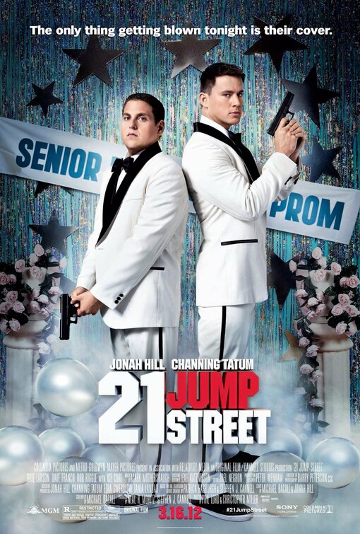 The poster is eye catching due to the bright colours (conforming to conventions of comedy posters), their bold white suits and the bold white title stand out from the darker background. The focal point of the trailer is the two guys in their suits suggesting they are the unique selling point of the film and are what the film makers want the audience to notice.
The title is big, bold and white but so are many other things in the poster like the characters suits, the balloons, the banner, the tagline but by putting the word "jump" in red it causes it to stand out from other parts of the trailer ad draws the audiences attention.
Directly underneath the title, in the same eye catching red, is the release date written, it is written in very small writing in comparison to the title but manages to still stand out due to it's bright colour. It's right at the foot of the poster (conforming to conventions) but it's not accompanied by the usual box of information that appears with it on the poster.
There is also no reviews or titles of any other films made by the same company/director/producer suggesting the two actors you see on the poster are the main selling point (reinforced in the sequel poster 22 jump street where just the actors surnames were listed above them showing how well known they are as they don't even need to write their first names). Also because this is based off a TV show they're hoping they may already have a pre-established audience and so don't need to impress audiences with what other films this company has made.
The genre of the film is established by the poster as it is very colourful (conventional of comedy), it's not dark enough to be a horror/thriller, there are guns suggesting it could be action and could be romance as there's the two main characters and some red in the poster but if people were unaware this was a comedy based on an old TV show then the tagline would help define the genre. "the only thing getting blown tonight is their cover" - it's funny, quirky, not romantic at all and suggests they're rubbish at what they do suggesting this is a humourous action rather than serious.
Theories:
Barthes action code is used as the black lining of their suits could suggest how things could turn dark for them at this prom. The symbolic and semantic code's are used as the characters white suits could represent how they're new to this and stand out because of that. An enigma code could be the guns the characters are holding causing the audiences to wonder if this is a comedy or action or bit of both, also a banner with the words "senior prom" is placed in the background behind the characters - if the audiences had seen the TV show then they would know these characters had to go undercover at a high school but if not then audiences may later wonder why they're at a senior prom.
Conforming to conventions = colourful, shows main characters, funny tagline, release date
Subverting from conventions = no billing block of information, no reviews
No comments:
Post a Comment