Film Poster
You're Not You
 The trailer is eye catching to to audience due to the bright colours it has in it contrasted by the plain grey background, it has a red glow to it which connotes love and possible death to (as this is a film about a terminally ill woman) but it is soft and so could possibly suggest that her death will be something happy at it's setting her free rather than being dark and sad like death normally is.
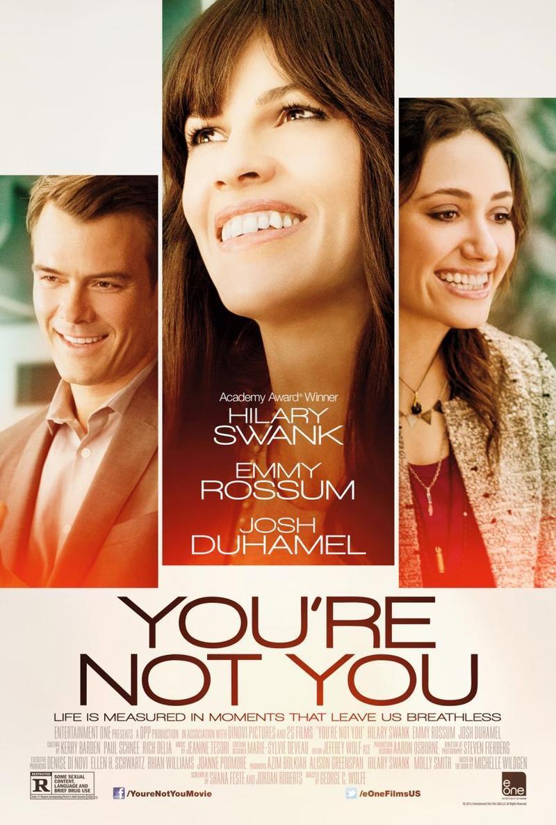
 The focal point of the poster is the 3 big bold images of the characters and conforms to conventions as in most drama posters you get to see the main characters - this is also good if you have big names in the film that will be a large selling point of your film (for example award winning actress Hilary Swank). The size of the pictures links to the characters roll in the film - Hilary swank's character is obviously the lead along with her carer (Emily Rossum) who has and almost as large roll, followed by the husband (Josh Duhamel) who has the smallest role of the three suggesting the film will predominantly be about the sick woman and her carer.
The title is also a focal point as it's big and bold and stands out to audience so they immediately know the name of the film that may interest them, its written in a soft black which, like the pictures, stands out from the plain grey background. It too just like the pictures has a red tint which brings warmth to the poster and could connote how loving this film is and how even in the worst times the characters outshine the bad as the red doesn't cover their whole picture.
It defines the genre quite clearly - it's too bright to be a horror or thriller, too plain and boring looking to be an action, not enough colour, it could possible be a comedy from looking at the pictures of the characters or even a romance especially with the red in the poster but the tagline makes sure audience know its a drama. The tagline "life is about moments that leave you breathless" gives the film some heart and is quite serious and moving in contrast to comedy taglines and it talks about life and not the people suggesting it's not a romance as romance film taglines usually focus on the characters specifically. Also it's conventional for romance films to show the two main love interests, the ones we as the audience are supposed to want to end up together and so by having 3 characters especially of such different ages shows this is more about family then romance.
There is no release date or 'coming soon' written anywhere in the trailer which is a major flaw - the audience have no idea when this film is set to come out, arguably the soft colours (red/orange) could connote autumn leaves and suggests it could come out in fall but that's a stab in the dark and something the audience shouldn't have to work out for themselves. There is also no reviews or films listed made by the same director/producer/company which is unconventional - although there is the standard block of info on the poster which stands out more than they probably wanted it too.
Theories:
Barthes action code is used as the poster shows them smiling, this is something people may just conventionally see in film posters as no-one wants to see sad people but this is a sad film and so the smiles could suggest the film ends well. Semantic and symbol code is also used as the red glow in the poster could show their loving relationship or that she ends up dying. As this is a drama its uncommon to find enigmas in the posters as that is more conventional or horrors/thrillers/action posters.
Conforming to conventions = shows characters faces, has titles in big bold writing, info block, names of award winning actresses put slap bang in the middle of the poster to draw the most attention to them (USP)
Subvert from conventions = no release date, no background colour
No comments:
Post a Comment